Top Menu Bar
The top menu bar is back!

Over the past few weeks I have received a ton of feedback on the new update.
The most disliked change was the removal of the top menu bar.
There are multiple reasons that the removal of the top bar was a bad design decision on my part.
The new menu bar allows you with just 1 click to access the most often used actions.
I truly hope that this new menu bar will help make the site easier and quicker to use.
New Options
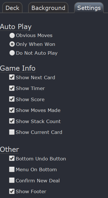
I have added a bunch of new options thanks to your suggestions:

- Show Timer/Score/Moves Made
You can now turn off the timer, score and moves made items at the bottom of the screen. - Show Stack Count
You can now hide the stack count that appears in the bottom left corner. - Show Current Card
The name of the card you are hovering over will appear in the bottom left corner if you turn this new option on. - Bottom Undo Button
If you really like having an Undo Button at the bottom, simply turn this option on. It's off by default because it causes cards to be slightly smaller due to the space the button takes up on the playfield. - Menu On Bottom
Don't like the menu at the top? Select this option and it'll be moved to the bottom! - Show Footer
You can now hide the bottom right footer. This also hides any "holiday" images.
Cards Too Small
Several folks have e-mailed about the cards being too small.
This is usually due to the web browser 'Zoom' being set to something other than 100%.
Zooming in enlarges text, which reduces space for the cards, thus making the cards smaller.
So if you are seeing small cards, make sure your 'Zoom' is set to exactly 100%
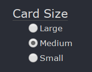
Cards Too Large
Several other folks have mentioned that the cards are too large!
Good news! Now you can now the cards smaller:

You can find these by clicking the "Options" button, then "Settings".
Thank you all very much for your feedback and I hope you all continue to enjoy playing :)
— Robert