Undo Move & Deal New
People seem to like having a "Deal New" button easily reachable on the main screen.
However I got feedback that the "Undo Move" and "Deal New" buttons looked too similar and it was too easy to accidentally click Deal New.
I have made some improvements to the buttons! Here is how they look now:
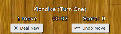
On a narrow display:
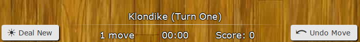
On a wide display:
Summary of changes:
- Each button has a different icon
- Undo Move is now on the right. This feels more natural for most players
- They are now slightly larger
- They now look the same on all computers
- On a wider display, when there is room, the buttons move further away
- All buttons on the site now have this new style
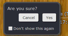
This should prevent any accidental new deals.
Don't like having to confirm? Just select "Don't show this again" and it won't ask you again :)
Next Card
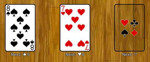
Some games have complicated rules regarding which cards must be placed next on a spot.
New players would often struggle to remember which card they needed next.
In the update I added a note to help with this:
However, some players found these notes distracting and wanted to hide them.
Now you can!
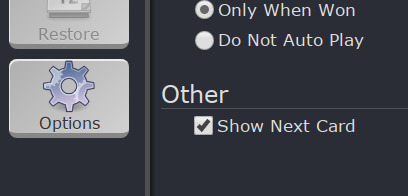
Simply go to Menu->Options and uncheck "Show Next Card":
Other Improvements
I've also made several other fixes and improvements:
- The Tango deck no longer looks messed up
- Cards are now larger in Royal Parade
- Sultan now correctly places the Ace of Hearts on the foundation
- A few more things :)
It's been very helpful!!
Keep the feedback coming and I'll keep making it more awesome :)
— Robert